CGZ
CASA GZ
Design Team:
Gabriel Cáceres, Daniel Lazo.
Collaborators:
Alejandra Sepulveda, John Miller.
Location:
Santiago de Chile / Chile
Total Area:
11000 m2
Built Area:
280 m2
Project Year:
2014
Materials:
Concrete, steel, glass, fibercement boards.
Renders:
SCL
Photography:
Pablo Casals Aguirre
Description
At the beginning of 2012 a young couple approached our practice for a house. They had fallen in love with the beautiful setting of a small community on the outskirts of Santiago. On top of a steep hill, no road to reach it, with all the utilities’ network down below, the plot posed quite a challenge. Amazing unobstructed views of the Chicureo valley, however, made it more than worth the effort. The clients were in no rush for the house to be built, so for a time the project was halted for them to put together the money for construction. In the meanwhile, we were tasked with figuring out how to build a road on the hill without either destroying it or bankrupting the client.
Two years later the road was done and the pieces in place for the project to resume. By then, the couple already had their first child and was expecting their second. The program increase forced us to scrap any previous schemes we had fiddled with and start over. The time lost however allowed us to get to know the couple much better, so by the end of the design phase the final project was tailor-made for them in a way that otherwise wouldn’t be possible. Reasonably, the view of the landscape became the house’s raison d'etre. A room without a view -no matter its purpose- was unacceptable. Also, because they had been living in an apartment for quite a while they felt very strongly that everything should fit onto a single floor.
A chain-like sequence of rooms became the logical layout for the house, where all of the common areas sit at the center of the chain with the couple’s master bedroom at one end and the children’s and guest rooms at the other. This gives the parents a certain level of independence once the children are older. Next to the kitchen a covered terrace was added to allow for the husband’s preference for grilling –no matter the season or weather.
The clients wanted a beach house feel for their home. An interesting request design-wise. As we saw it, the main difference between a holiday home and a regular one is lack of definition in the program’s boundaries. To address this idea, the design was to deliberately avoid creating one-purpose-only spaces, like corridors. Ironically, because of the nature of the chain-link layout, a corridor was actually needed to connect each space without having to resort to a Versailles-style series of connecting rooms. The needed corridor was then broken, displaced and distorted, for the pieces not to resemble a corridor and allow other uses than the obvious one. One piece became the entrance hall/gallery space -almost 5 meters tall and lit from the sky - that showcases the client’s incipient art collection. The other, not as tall but twice as wide, became the children’s play/study room. A small patio separates both. Living, kitchen and dining rooms are all integrated into a single space, enclosed by large windows at two sides. Both sides slide back to expand the fun to the adjacent covered, outdoor terraces when desired. Boundaries were also blurred at the master bedroom, with just a big walk-in closet dividing it from the bathroom, no doors whatsoever.
Atop a set of boulders protruding from the hill at mid-height, the long and narrow chain-link scheme creates a gravity-defying image. Both ends cantilevering freely, it seems like a balancing act. Despite the effect, the house’s concrete slab rests safely over a podium defined by retaining walls of the same material. Slim, slanted columns were added wherever extra support was needed. Their irregular shape and inclination exaggerate the sensation of instability. Outside, Equitone© fiber-cement boards were used to clad the whole of the steel structure that arises from the slab and shapes the house. An air chamber between this skin and the house’s inner envelope is placed to help with its thermal comfort. Because of its color, the cladding and concrete give the house a monolithic appearance, only subverted by the glass façade that faces the panorama. This controlled material palette makes the house a constant monochromatic counterpoint to the extreme changes in color and vegetation that the site undergoes through the seasons –from desert-like shades of browns and yellows in the summer to the most exuberant greens during the winter.
Four years after their call, the now full-blown family of four finally moved to their tailor-made house on a hill. Happily, they found it to be a comfortable fit.
DSP
DSP APARTMENT BUILDING
Design Team:
Gabriel Cáceres, Daniel Lazo.
Collaborators:
John Miller, Tomislav Mímica.
Location:
Santiago de Chile / Chile
Built Area:
385 m2
Project Year:
2018-2019
Materials:
Precast concrete, steel, glass, expanded aluminum mesh.
Model:
Nicolas Allende
Renderings:
Ken Qiu
Photography:
Bruno Giliberto
Description
The city of Santiago like many other capitals of the developing world is going through a fast-paced urban transformation process. Long-neglected parts of the city have seen a dramatic surge in real estate development and construction over the last 20 years. The city’s downtown neighborhoods have been affected like no other. Mostly abandoned to economic and institutional roles during the eighties, the new century has brought a steady, exponential repopulation process. Along with the positive outcomes—like the reappreciation of public space and urban life—rising real estate prices and rents are making it increasingly difficult for the new urbanites to find housing, while predatory urban development practices threaten to erase the very character that brought them to these neighborhoods in the first place.
The Ochoalcubo DSP project proposes a sustainable way for housing development. Fitted in a lot previously occupied by just one residence, it’s an exercise in micro-scale density. Three different apartment typologies are housed inside a precast concrete shell: a 1730-square-foot duplex apartment on the ground floor with a large backyard; a 700-square-foot studio apartment on the second floor; and a 1400-square-foot penthouse at the top that enjoys the whole rooftop. At the center of the building, an ethereal steel-plate staircase, painted bright cerulean, provides access.
The building structure is basically a shelf that spans the width of the property, built with precast walls and a double-tee flooring system, traditionally used for multi-story parking garages given the long spans it achieves without the need for central support. This single quality allows for the multiplicity of types inside the building, making each floor’s interior effectively independent from the one below. An expanded aluminum veil covers front and back facades providing both shade and privacy from the street.
FHQ
FINTUAL HEADQUARTERS
Design Team:
Gabriel Cáceres, Daniel Lazo.
Collaborators:
John Miller, Tomislav Mímica, Diego Melero.
Location:
Santiago de Chile / Chile
Built Area:
500 m2
Project Year:
2020
Materials:
Stainless steel, glass, laminated wood panels.
Photography:
Bruno Giliberto
Description
Over the last decade, Chile’s startup scene has positioned itself as one of the leaders of the region. Ambitious government programs mixed with a booming generation of young innovators has turned the small South American country into an internationally renowned hub for emergent tech entrepreneurs, reaping an important number of interesting and successful technological products. Fintual is one of those groups of entrepreneurs—founded in 2016 and live since 2018—their goal is to bridge the gap between financial investment tools and the general non-savvy public, by way of technology and a candid and straightforward strategy of communication with their clients, sprinkled with a healthy dose of humor. As of 2020, they manage funds for 47 thousand clients at more than 425 million USD—a big jump from the 7 thousand clients and 44 million of the year before, which meant they needed more people on their team and eventually a bigger space.
The Droguett Palace has lived many lives. An urban residence for a wealthy family built in 1931 by famous architect Sergio Larraín García-Moreno, the 12-bedroom, 1400 sqm building became one of the city’s staples in the early 80’s when the family heirs transformed it into an event venue. It was at this time that its huge (300 sqm) 2nd floor outdoor terrace was covered with the glass and steel barrel vault that would give it its characteristic look and earn it the moniker “The Glass House”.
In 2011 the venue closed its doors and started a new life as an office and coworking hub for innovation and entrepreneurship, first for a global conglomerate and later for StartUp Chile, the country’s government-run startup accelerator program.
In late August of 2020, in the midst of the global pandemic, just as the city of Santiago was coming out of a 4-month-long lockdown, we were commissioned—through a brief private competition—to design the headquarters of Fintual at the Droguett Palace, which they had just leased. The brief was straightforward. The project would be developed in stages, with the first one being the main office floor located on the building’s second level. Needing to accommodate 40 to 60 employees at all times, the project was to provide multiple ways of working, from conventional desk work to hot desking, private and group conference calls, as well as more laid-back living room and coffee shop type situations. It had to be a fun space to work in and it should reflect the horizontal culture of the company. And they wanted plants. Lots of them.
There was one caveat, though. They needed to move in fast.
The general scheme for this first stage was developed in 10 days—during the competition phase—and concentrated primarily on the former outdoor terrace now covered with the barrel vault of glass, or “pergola” as Fintual calls it, since the interior of the palace needed less of an intervention and more of a furnishing because of its already superb spatial qualities.
The plan for the pergola was simple: replicate the order established above by the barrel vault, down below. The rectangular cross section of the vault would then divide the space into two main areas, one for the working stations and the other—irregularly shaped—allowing different types of work situations. For this, we developed a series of objects, all familiar between each other and named according to what they looked like or their function (a snaking desk is “the worm”, while the private pods are “the booths”, for example). Except for the desks (fabricated in matte white) all the elements shared the same materiality: laminated wood boards.
Working within a tight building budget, it was established early on with the client that we were looking for a low cost but elegant aesthetic, balancing the cheap with more expensive accents, or “like wearing a worn-out T-shirt with some expensive jeans” as Pedro, one of the company’s founders, once told us. The wood provides a good example of this approach, while not the cheapest wood available, it has a nice warm color and is free of knots , giving the furniture a more homogeneous and abstract look, like a solid piece, while on close inspection the on-site fabrication would reveal slight imperfections and a certain rustic quality.
The whole space would be painted anthracite black, to cancel all the visual noise produced by utilities networks, insulation foam boards, and the array of girders and structures that run through the ceiling, and to make a stark contrast from the chalk white interior of the palace.
The finishing touch was a stroke of luck. At some point in the building’s life the original luxurious white terrazzo tile floor of the terrace was clad with a cheap photo-laminated engineering flooring. But after removing the coverings: there it was, all complete and in decent condition, all it needed was a thorough polish and sealant.
Since Fintual needed to move in quickly and we needed time to develop construction documentation, we divided the construction in two: a wet and dirty phase—meaning all the work that cannot be done with people using the space, including painting the entire second floor and polishing both the terrazzo as well as the beautiful parquet flooring on the palace side—and a clean phase—involving both on-site and off-site fabrication of the furniture and power network, while working around Fintual using the space.
That everybody involved made it work despite strict transit restrictions, lockdowns, curfews, a national shortage of building materials, and of course a global pandemic, seems like an achievement already. But the project is as rewarding by exploring contemporary architectural issues on heritage buildings, and hit-the-ground-running strategies to design, while celebrating the innovative and forward-thinking culture at the core of Fintual.
LUX
MAISON A LUXEMBOURG
Design Team:
Gabriel Cáceres, Daniel Lazo.
Collaborators:
John Miller, Tomislav Mímica, Jose Vizcaya, Diego Melero.
Location:
Luxembourg City, Luxembourg.
Built Area:
550 m2
Project Year:
2018-2019
Materials:
Concrete, steel, glass, bronze, marble.
Renderings:
Tomislav Mimica, Jose Vizcaya
STO
GLOBOX PRODUCTION COMPANY HQ
Design Team:
Gabriel Cáceres, Daniel Lazo.
Collaborators:
John Miller, Tomislav Mímica.
Location:
Santiago de Chile / Chile
Built Area:
140 m2
Project Year:
2018
Materials:
Polycarbonate sheets, glass, wood.
Photography:
Felipe Fontecilla
Description
Since the late 90’s, an early 20th century house in downtown Santiago has been home to an important part of Chile’s underground electronic music scene. The “Santo Remedio Bar and Restaurant”, occupying its first floor, it is a venue where renowned local DJ’s have played their first sets, and host to an important list of international stars. When the owner’s production company -responsible for important music festivals across the country- decided to relocate their operations to the second floor of the house, they required for a radical transformation of the former hair saloon space. Multiple precarious conversions had left their mark all across the old adobe-and-timber structure, and it was in a weakened state. Adobe craftmanship has become a lost art, and as such restoration of this kind has become quite expensive. A limited budget and time schedule rendered the possibility of restoring the walls to its original state, a dead end. Striping the adobe from the dividing walls and reinforcing the timber skeleton was needed but budget constraints meant that it was to be done in localized form, leaving the interior walls an unsightly mish-mash between leftovers of the previous conversions (fiber cement, sheet rock and tin panels haphazardly attached) and patches of naked structure.
The project then became the act of sheeting this mess, front and back, with semi-translucent polycarbonate panels, turning the chaotic patchwork of materials into an abstract array of shadows that change depending of the source of the light. During the day, sunlight would give the plastic warmer tones, and LED geometric lines of light would tint it a blue hue at night. The same idea was then repeated for the main office room ceiling by hanging a metal mesh of expanded aluminum, and again for the meeting room with a hanging polycarbonate ceiling below a skylight the whole size of the room. The few divisions of the entire space where handled with aluminum sliding doors, and the galvanized steel pipes of the electrical network where left exposed. For the connecting corridors, a loose spaghetti-like hanging lamp was designed out of LED tubes. To counter this rather cold industrial look, a grainy German oak wood was selected for the flooring, the one and only expensive item of the whole endeavor.
The stark contrast between the brisk irregularity of the adobe walls still exposed, the refined dignity of the oak, and the machine precision of both the translucent plastic and aluminum mesh, do this time make for a more sightly mix of ingredients.
TIP
TERMINAL INTERNACIONAL DE PASAJEROS MAGALLANES
Competition Entry
Authors:
TCL Architects.
Design Team:
Daniel Lazo, Albert Tidy.
Collaborators:
Ken Qiu Sun, Loreto Cerda, Cristóbal Riffo.
Location:
Punta Arenas, XII Region de Magallanes / Chile
Built Area:
45000 m2 (Masterplan)
3500 m2 (TIP building)
Project Year:
2017
Materials:
Concrete, steel, glass.
Renders:
Loreto Cerda
FCS
EDIFICIO EMILIO PUGÍN FACULTAD DE CIENCIAS UNIVERSIDAD AUSTRAL DE CHILE
Competition / First Prize
Architect:
Tidy Arquitectos
Design Team:
Albert Tidy, Daniel Lazo (as associated architect).
Collaborators:
Nicolas Solis de Ovando, Eduardo Tapia, Victor Bustos, Roberto Jacob, Tom De Soete, Cesar Osorio.
Location:
Valdivia. XIV Region de los Rios / Chile
Built Area:
10620 m2
Project Year:
2009-2012
Materials:
Concrete, glass, steel.
Photography:
Pablo Casals Aguirre
MRN
RAPA NUI MUSEUM
Competition Entry
Design Team:
Daniel Lazo, Gabriel Cáceres.
Collaborators:
Tomislav Mímica, Diego Melero.
Location:
Rapa Nui, V Region. Chile.
Built Area:
7300 m2
Project Year:
2024
Materials:
Pre-cast Concrete, steel, glass.
Renders:
Tomislav Mimica
MASTERPLAN
“The Garden of Museums”
The masterplan proposes a building built with landscapes.
It is conceived as a large garden, composed of a sequence of diverse and sometimes contradictory landscapes: natural or artificial; exterior, covered, or interior; public or intimate; of worship, culture, or memory. These are contained by sinuous contours of stone and concrete—like enormous Manavai—which in turn act as thresholds that connect, organize, and give meaning to the sequence. Depending on their size, they can define both large open areas and programmatic pavilions.
The shape of the contours is defined by two main objectives:
1. In addition to containing, it seeks to recognize the significant elements pre-existing on the site—natural and built—by incorporating them into the sequence: embracing the tree masses and bringing their greenery into the pavilions and gardens; redefining the remains of the farmland as part of a museum collection of historical objects; and framing the unobstructed views of the Poike Volcano and Maunga Pu'i to the east.
2. It seeks to ensure the configuration of a large, open, public central space—independent of the MRN's operations—that organizes the complex. This space unfolds with a marked eastward direction, toward the Poike and the Ceremonial Esplanade that crowns the Garden.
RAPA NUI MUSEUM
“The Black Stain and the Lamps”.
The museum's architecture is conceived as a journey, and is built through the intersection of two forms: the first, which adapts to the landscape like magma, and which owes its geometry, color, and materiality to the island's megalithic architecture and its geography. This form contains the open spaces and the buildings.
The second form is born of functional efficiency; it is a set of boxes containing enclosures, but when they emerge from the black stain, they do so as seven lamps that guide the visitor on their journey toward the east, the ceremonial space, and the Poike.
Boxes
The project groups each area of the MRN into regular volumes, which are distributed on the site based on their need to relate to each other and to the existing environment.
Contours
Walls constructed from basalt-colored precast concrete columns, spaced 120 cm apart, envelop the programmatic boxes, like large stone taupea.
The space between the columns can be completely traversed—by visitors or the landscape—, translucent with glass, or closed with stone, when needed.
This intermediate space protects from direct solar radiation, naturally ventilates much of the project, and its columns reduce wind speed.
Floor
The floor of the museum and annex pavilion mimics the natural slope of the terrain, correcting it to ensure universal accessibility or when the program requires horizontality.
DPX
DUPLEX
Design Team:
Gabriel Cáceres, Daniel Lazo.
Collaborators:
John Miller, Tomislav Mímica.
Location:
Santiago de Chile / Chile
Built Area:
90 m2
Project Year:
2017
Materials:
Concrete, stainless steel, glass, wood, microcement flooring.
Photography:
Daniel Lazo
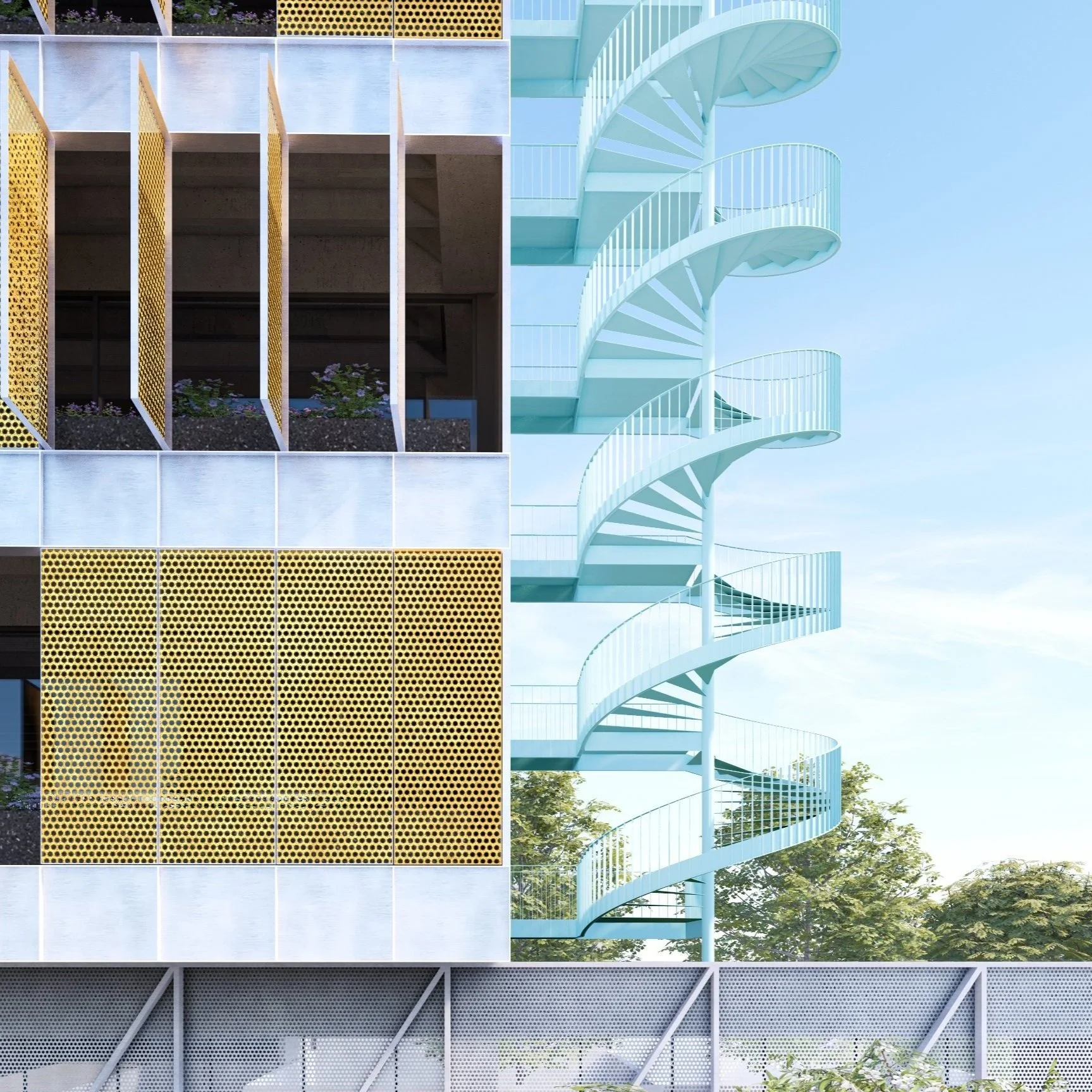
RDB
ROMAN DIAZ BUILDING
Design Team:
Gabriel Cáceres, Daniel Lazo.
Collaborators:
John Miller, Tomislav Mímica.
Location:
Santiago de Chile / Chile
Built Area:
15.000 m2
Project Year:
2022
Materials:
Concrete, steel, glass, expanded aluminum mesh.
Renderings:
Tomislav Mimica
MMVSL
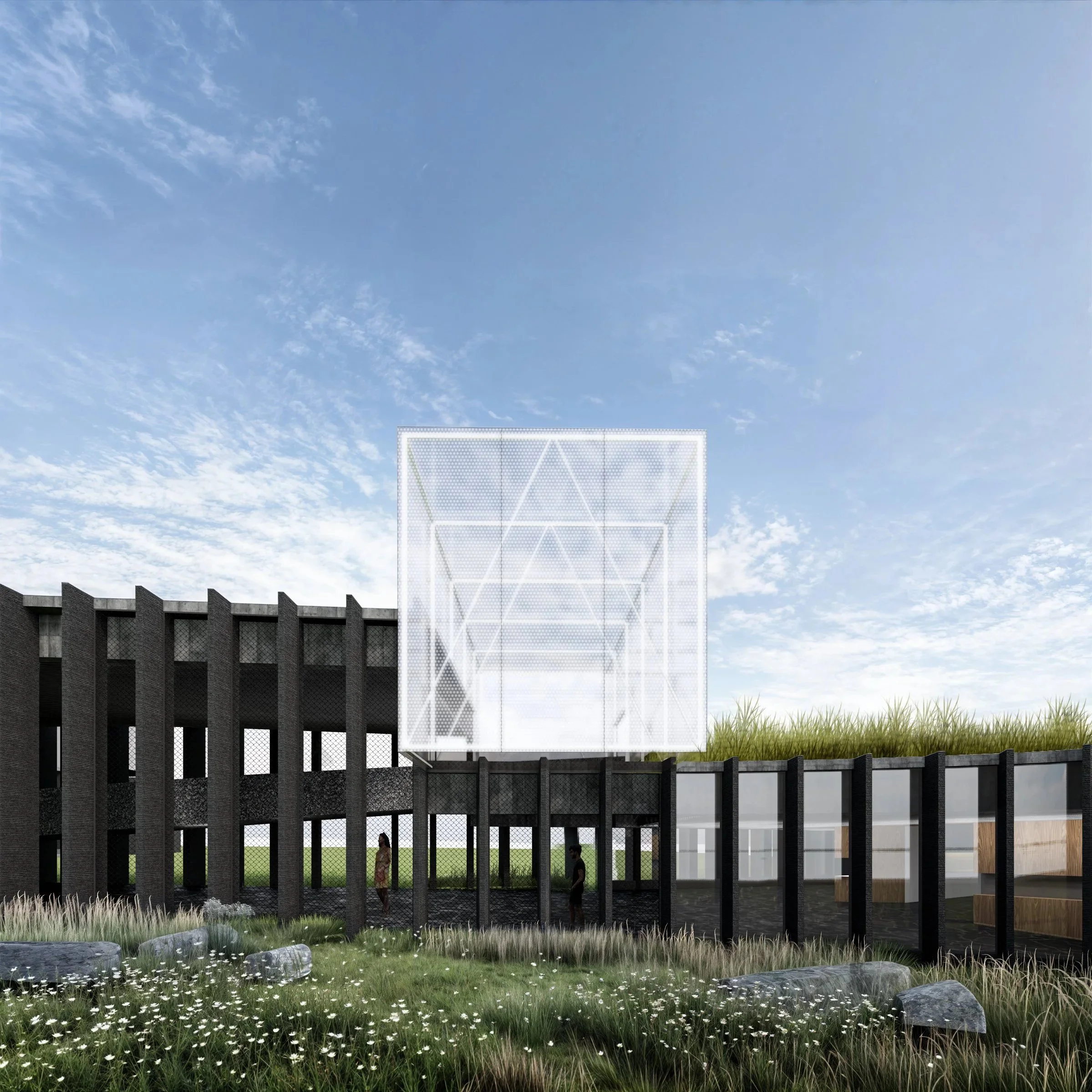
MUSEO MEMORIAL VILLA SAN LUIS
Competition Entry / 2nd Prize.
Design Team:
Daniel Lazo, Gabriel Cáceres.
Collaborators:
Tomislav Mímica, Diego Melero.
Location:
Las Condes, Santiago de Chile
Built Area:
800 m2
Project Year:
2025
Materials:
Concrete, steel, glass.
Renders:
Tomislav Mimica
PROJECT OBJECTIVES
How can a museum be designed within the ruins of the very testimony the museum seeks to rescue and enhance, without sacrificing the authenticity of that testimony? How can this be done so that, despite the necessary alterations to which the ruin will be subjected, the museum makes this testimony something evident and unavoidable to its visitors? And how can it be integrated into the city and the complex that houses it, after being for years a symbol of conflict, of a disputed terrain?
The memorial museum project seeks to answer these major questions expressly posed by the competition.
STRATEGY
To accomplish this objective, three considerably simpler questions derived from the brief must be answered first:
1. Area. How can an 800 sqm memorial museum be designed within the existing 910 sqm chassis of a residential building? Logic dictates that the difference in surface area between the existing and planned areas must be resolved through demolition. Given that at least 70% of the existing structure must be preserved then: what should be demolished?
2. Change of use. The transformation of a building from residential use to a public use, such as the memorial museum, entails an increase in the load to which the structure will be subjected—for the simple fact that it will have to accommodate a much larger number of users than originally planned—therefore, the structure must be reinforced. Since the budget is limited, reinforcing the entire structure—although it may sound logical—is counterproductive. All museums have a considerable number of spaces inaccessible to the public, so reinforcing them is a waste of resources. Considering also that the commission requires preserving the imprint of the original building, then: what should be reinforced?
3. Program. While historically, it is common to find that many museums exist within structures that were not originally designed for that purpose (the Louvre in Paris was a military fortress and later a palace before becoming a museum; the Tate Modern in London was a power station), and in particular, that exhibition spaces inhabit buildings of the most diverse types, including residences and apartments, the truth is that under ideal conditions, residential and museum programs require different spatial characteristics: lighting, air ventilation, public circulation, etc. In turn, different ways of reinforcing structures produce different spatial characteristics. Broadly speaking, we can identify two types of reinforcement: stereotomic, composed of solid elements such as walls and slabs; and tectonic, rigid diaphragms of beams, columns, and braces. It is logical, therefore, to assume that the way a structure is reinforced is fundamental to reconciling the differences between the spatial requirements of the different programs. So, then: how to reinforce?
While these three questions may seem strictly pragmatic, the product of a clinical analysis of the brief and disconnected from the actual content of the new museum, truth is that the answers arise directly from that content and seek to fulfill the project's larger objective.
The Memorial Museum proposes three themes that shape each answer.
THE MEMORIAL MUSEUM AS A NARRATIVE SUPPORT
Museum and exhibition spaces stand out for being eminently spaces of circulation: they contain movement. While they allow for permanence, when it occurs, it is temporary. They also suggest a speed for that movement. Depending on the type of exhibition, this wandering can have a direction—which the visitor can follow or ignore. Museums are like books; they can tell a single story, like a novel with different chapters, or compile a set of stories that share one or more themes, like an anthology. In the case of the MMVSL, the memorial museum tells the true story of a group of buildings and the community that inhabited it, with their struggles, triumphs, and tragedies over a period of more than six decades. Its history is also an inescapable reflection of the country's recent history, of the human tragedy of the dictatorship, and of the city of Santiago in particular. From an academic perspective, it is also a reflection of the paradigm shift surrounding urban planning in Chile, from a centralized model to a free market one.
This history is divided into three chapters, each with distinct thematic emphases, but which maintain a unity. It is a single story. Each chapter provides vital information for understanding the next. There is directionality in the narrative and therefore in the movement within the museum.
This idea, however, is in conflict with the architectural reality of the existing building. Due to the nature of its residential use, each space is independent from the previous one; they are connected only by a vertical circulation core that distributes to each space per floor. Even in its current state, with part of its interior divisions removed, the floor plan is divided into four quadrants. There is no directionality in the route.
The proposal seeks to correct this through the selective demolition of slab areas (what should be demolished?), allowing a vertical connection between floors. It is selective because, to keep costs under control and preserve the imprint of the original building, it was decided to isolate the demolition to only the eastern hemisphere of the structure.
This operation allows for the creation of three large double-height spaces containing each chapter of the exhibition. The position of the demolition determines that each gallery occupies the quadrant opposite the gallery on the floor below, so they always share a connecting floor. This creates a vertically snaking path—the visitor must pass through one room to reach the next—suggesting a direction to the wandering.
THE MUSEUM AS A SOCIAL CONDENSER
Museums, unlike other exhibition spaces, such as art galleries, are distinguished by a public and educational vocation. This means that, along with the spaces that house the exhibition, they offer other complementary spaces that operate simultaneously—regardless of whether the visitor visits the exhibition or not—broadening the spectrum of audiences the museum serves. Contemporary practice has well understood this potential impact and has turned several museums into destinations not only for culture but also for meeting and community. By becoming true social condensers museums across the world welcome daily thousands of citizens who visit them regularly and free of charge, whether to meet someone, eat, or seek shelter from the weather. This logic allows the museum's impact radius to expand to an urban scale, and also helps fund the building's operation.
Based on the building's structural history, it is known that the change in use from residential to museum implies that those areas designated for public use must be able to withstand twice the load overload that the structure currently withstands – from 200 to 400 kg per sqm. Therefore, the definition of these areas, and how the program is laid out within the building, is key to answering the second question: what should be reinforced?
The project proposes dedicating the east side of the block to exhibition spaces, which, due to the demolition involved, requires reinforcing this area in its entirety.
For the west side, the proposal seeks to minimize the intervention areas in order to maintain the imprint of the original building. The program's layout within the western hemisphere is proposed as follows:
a) The first floor contains the entrance and related service areas: the lobby and reception/ticketing area, restrooms, and the soup kitchen and communal dining room. Since there are no basements, the first floor requires no reinforcement and can therefore fully retain its original characteristics.
b) The second floor is used for storage areas, both general and documentary. This is a strategic play. Considering that the interior height of each floor inside the block is 2.3 m, any structural reinforcement will diminish habitability conditions. Locating the storage areas on the second floor allows for reinforcement of both the second and third floor slabs without directly affecting these floors. Because it is primarily used as an archive and storage area, this floor can function without problems even with limited habitability conditions.
c) The third floor contains the co-working area and is connected to the documentary storage area via a direct staircase. Since the lower floor is already reinforced, it does not require further reinforcement inside.
d) The fourth floor is divided equally between the museum offices and a reconstruction of one original apartment. Due to their private use in the case of the offices, and as public access to the apartment should be restricted to groups of five people at a time, no reinforcement is required.
This layout seeks to enhance the building's public character, but in particular, to transform it into a meeting space for the community. The first floor is enlivened by the soup kitchen, its terrace, the gift shop, and a tree-lined plaza with Wi-Fi facing the north facade.
THE MUSEUM AS A MEMORIAL
The museum's status as a memorial requires thoughtful consideration about the image the intervention on the existing structure will produce. Since the building itself is a testament to the history of the Villa San Luis Complex and the community that inhabited it, it is essential that the intervention clearly differentiates what is new from what is preserved. This idea, then, motivates the project's answer to the third question: how to reinforce?
A stereotomic reinforcement method in reinforced concrete (based on walls and slabs) is ruled out, since the difference between the new and original structures would be difficult to understand, as both share the same materiality and geometric characteristics. Additionally, the dimensions of the elements that make up a structure of this type would considerably reduce interior habitability conditions and make the execution of the work a much more complex and, presumably, costly operation.
The project proposes a reinforcement method using rigid diaphragms of cold-dip galvanized steel. Basically, a skeleton adheres to the areas to be reinforced. Due to its slenderness, the original structure remains visible even in areas with a high density of reinforcement. Furthermore, its material and geometric characteristics—being composed of profiles—make its bracing role evident.
The reinforcement areas proposed are two: the first, and most extensive, encompasses the entire east side of the building, from floors 1 to 4; the second area, is restricted to only the second floor of the west side.
Both interventions fulfill opposing roles in architectural terms:
- The intervention on the east side is expressive. Impossible to hide—due to its size and the program it contains—on the contrary, it embraces its transformative role in the interior space and exhibits its muscularity, revealing the tensions to which the structure is subjected. Additionally, it addresses the reconfiguration of both the vertical circulations—vital in constructing the exhibition's narrative thread—and that of the east façade, the one most affected by the demolitions the structure underwent prior to its declaration as a national monument.
The design of this façade above all avoids falling into historicism and, in line with the principles of modern architecture that shaped the Villa San Luis complex, is resolved in a rational and pragmatic manner, primarily addressing the building's interior functionality, but utilizing contemporary materials and techniques—such as sustainable design methods—giving the building's design an undeniable contemporary appearance. This is also relevant, given that from an urban perspective, the image of this façade enters into a dialogue with the contemporary image of the buildings in the Nueva Las Condes complex, which it faces.
- The intervention located on the second floor of the west side of the building, on the contrary, seeks to disappear. The goal is to concentrate a high structural density within the interior to free the other floors from any additional reinforcement. In structural terms, this translates into a stereometric steel structure confined by the existing walls, beams, and slabs of the second floor.
This strategy not only allows floors 1, 3, and 4 (on the west side) to be maintained virtually in their original condition, but also allows the west façade to be preserved without further intervention. This is of particular importance, since this is the façade that faces the public space, the city. It is only fair, then, that the façade that was spared from demolition—by pure chance, since they could have started demolition with it first—is the one that welcomes citizens who visit the memorial museum.
Based on this, the project proposes restoring this façade, repairing the stucco and repainting the piers that divide the windows based on their original colors. This also creates an interesting counterpoint between the west and east facades: while the former is an architectural testament to the museum's history, the latter showcases its inner life, the movement of visitors, community activity, and culture.
Container and content at the same time.
2LSD
2LSD APARTMENT BUILDING
Design Team:
Gabriel Cáceres, Daniel Lazo.
Collaborators:
John Miller, Tomislav Mímica, Diego Melero.
Location:
Santiago de Chile / Chile
Built Area:
385 m2
Project Year:
2021
Materials:
Precast concrete, steel, glass, brick.
Renderings:
Tomislav Mimica
31M
OFICINAS APLAPLAC
Design Team:
Albert Tidy, Gabriel Cáceres, Daniel Lazo (as TCL Architects).
Collaborators:
Sebastián Cruz
Location:
Santiago de Chile / Chile
Total Area:
600 m2
Built Area:
110 m2
Project Year:
2013
Materials:
2x4” pine wood slats, 4 mm. polycarbonate honeycomb sheets, 25mm plywood boards.
Photography:
Pablo Casals Aguirre
Description
As side effect of an important commission for designing a multi program complex in an old hat factory, we were given the opportunity to establish our architecture studio temporarily in what’s perhaps every architect’s dream: a huge old industrial warehouse.
The warehouse -kindly provided to us by the clients of the project, for as long it takes to see it through- possess remarkable qualities in terms of space, sun light and openness. Its precarious thermic conditions, however, made it also uninhabitable.
To solve this issue, we required of an ephemeral and disposable enclosure that allowed us to operate in conditions of comfort and livability, but achieved in a minimum amount of time and as cheap as possible.
The final result is a modest structure of 2” by 4” pine wood slats, completely cladded in translucid 4 mm. thick polycarbonate honeycomb sheets (105 x 290 cms.), including the ceiling. The measurements of every element involved were done considering the commercial dimensions of all materials, reducing the left over loss. In addition, to avoid any interior structural element, we used prefab H beams -manufactured in pine wood and OSB boards- capable of covering the whole span of the structure while supporting the weight of the entire ceiling.
This 8.5 x 8.5 x 2.9 meters box allowed us to reduce the air volume to control, and achieve thermic comfort without much effort. Two “Split” HVAC units keep the entire box at constant 21 degrees Celcius.
After publishing our temporary installations, we were contacted by “Aplaplac Production Company”, creators of the hit children TV show “31 minutos”, entirely played by cloth puppets -in the tradition of Sesame Street- and of a budget inversely proportional to its genius level of creativity.
Till this point in time, the whole production company operation was dispersed and precarious, with their offices located in one place and the storage space in another, while having to rent the recording studio when filming each season of the tv show. In 2013, they finally decided to consolidate each individual element of the program under one roof: a new industrial warehouse located in an old residential neighborhood in downtown Santiago.
Faced with the same challenge we had already encountered, Aplaplac decided to hire us to repeat the same solution, but adapting it to its new requirements. Needless to say, the opportunity to design the offices of puppets stars such as “Tulio Triviño”, “Juanin Juan Harris”, “Bodoque” and “Guaripolo” proved to be impossible to resist.
This time around, the proposal was to repeat the strategy but with three different boxes, varying in sizes to accommodate each individual part of the program. From the warehouse access, the first box contains the administrative and executive offices of the show. The second box and the biggest in size, holds the scriptwriters offices. The third and final box is the show’s workshop, where the puppets are manufactured. The rest of the warehouse´s space -more than half of the total space- remains free for storage use as well as for the recording & filming studio.
The parallelism of the boxes layout is deliberately broken as to create tension and vantage points between them, in reference to works such as the “Metaesquemas” (1958-1959) created by Brazilian artist Helio Oiticica.
The in-between space generated by the layout, creates a relationship between each individual element and the others as well as with the warehouse that contains them. These spaces allow more informal events to happen, like small rooms for leisure.
The entire project was built in 3 days, and the end result left the cast of “31 minutos” happy enough that they insisted in being part of the photo-shoot that we’re now publishing.
FI
FACTORIA ITALIA
Competition / First Prize.
Design Team:
Albert Tidy, Gabriel Cáceres, Daniel Lazo (as TCL Architects).
Collaborators:
Victor Bustos, Tomas Mascaró, Sebastián Provoste, Sebastián Cruz, Gabriel Díaz.
Location:
Santiago de Chile / Chile
Built Area:
37700 m2
Project Year:
2012-2014
Materials:
Concrete, steel, glass, brick.
Photography:
Aryeh Kornfeld (Exterior)
Daniel Lazo
DPAV
DPAV THEATER-RESTAURANT
Design Team:
Gabriel Cáceres, Daniel Lazo.
Collaborators:
Alejandra Sepulveda.
Location:
Santiago de Chile / Chile
Total Area:
860 m2
Built Area:
800 m2
Project Year:
2014
Materials:
Concrete, steel, glass, fibercement boards.
Photography:
Pablo Casals Aguirre
Description
Over the chassis of an early 20th century house a constellation of objects, related in geometry, color and character, is proposed. Their strategic placement –sometimes disruptive to the logic of what already exists- transforms the interior of the house and forces a redefinition of the role of each program component. Removal of adobe cladding from some interior dividing walls amplifies this change, leaving bare the oak structural skeleton and generating new and unexpected visual connections.
The change in use –from residential to cultural, private to public- is evidenced by the scale of the new objects (doors, windows, furniture, lighting fixtures, etc.) that respond to and anticipate this new order, as a reflection of the episodic nature of the events that take place here.
The most dramatic part of the operation is the insertion of a small 200-seat dinner theater in the space previously occupied by a series of small, precarious expansions to the original building. The theater itself is treated as another object: monolithic and introverted from the exterior, just three openings interrupt its envelope. On the contrary, the interior is soft and expressive, courtesy of an acoustic skin manufactured on-site with timber slats of varying sizes and sections.
The house as much as the theater works as a stage for music and dance. Performers move, along with the guests, from the “quincho” –an inner-courtyard redefined by a 6-meter high chimney over a barbecue pit in the center of the space- to a media gallery, and then the dinner theater for the main event.
The end result is an architecture of things, where the new -monochrome and abstract in design- is in constant tension with the historicist architecture of the existing house, in a deliberate game of contrasts.
BFC
BODEGÓN FERROVIARIO CARAHUE
Competition entry
Design Team:
Gabriel Cáceres, Daniel Lazo
Collaborators:
John Miller
Location:
Carahue, IX Region de la Araucanía / Chile
Built Area:
400 m2
Project Year:
2016
Materials:
Concrete, steel, glass, wood.
Renders:
SCL
EMP
PROVIDENCIA CITY HALL CAMPUS
Competition Entry / Honorable Mention.
Authors:
TCL Architects.
Design Team:
Daniel Lazo, Gabriel Cáceres, Albert Tidy.
Collaborators:
Ken Qiu, John Miller, Tomislav Mímica, Sebastián Simonetti.
Location:
Santiago de Chile
Built Area:
12500 m2
Project Year:
2017
Materials:
Concrete, steel, glass.
Renders:
Ken Qiu
Model:
Nicolas Allende
8Q
CASA OCHO QUEBRADAS
Design Team:
Gabriel Cáceres, Daniel Lazo
Collaborators:
John Miller
Location:
Los Vilos, IV Region de Coquimbo / Chile
Built Area:
110 m2
Project Year:
2016
Materials:
Prefab Concrete, steel, glass.
Renders:
SCL
Description
Context.
Ochoalcubo, is an exceptional housing development on the coastal town of Los Vilos, designed by 16 internationally renowned architects from Japan and Chile. A second stage named Ochoquebradas has been launched, inviting emergent architecture practices.
Studio CL produced the 3X7 House project for this purpose.
Project.
The 3X7 house is an architectural exercise in economy. Not only in relation to the cost of the project but also, the use of resources and space. The 3X7 house is named after the number of times it repeats the same basic unit to produce it. The unit is a prefabricated reinforced concrete casket, an ordinary, uninteresting element commonly used in infrastructure of all kinds (bridges, canals, etc.). Nevertheless, it boasts a generous interior (an inner section of 3m by 3m and 1.5 m depth). 3 naves, units long, placed side-by-side, make a 110 sqm house. Each nave is divided differently so as to organize the program. While the side naves contain the bedrooms and bathrooms, the central nave houses the public spaces - living, dining, and kitchen - in one integrated continuous space. This nave also connects with each different room. Perforations in the concrete structure, give direct access to each space, eliminating the need for aisles and maximizing the useful floor area of the house. Both floor and the walls exposed to the elements are internally lined to improve thermal comfort, as well as to hide utilities. A concrete rooftop terrace tops the house, adding an extra space while protecting the roof insulation.
MALI
MUSEO DE ARTE DE LIMA NEW CONTEMPORARY ART WING
Competition entry
Architects:
Pablo Talhouk Arquitectos Asociados + SCL.
Design Team:
Pablo Talhouk, Andres Briones, Daniel Lazo.
Collaborators:
Erick Marín, Layla Jorquera, Fernando Torres, John Miller.
Location:
Lima, Perú.
Built Area:
6500 m2
Project Year:
2016
Materials:
Concrete, steel, glass.
SEV
CENTRO CULTURAL SITIO ESTANQUE
Competition / Third Prize
Design Team:
Albert Tidy, Gabriel Cáceres, Daniel Lazo (as TCL Architects).
Collaborators:
Sebastián Cruz, Victor Bustos, Tomas Mascaró.
Location:
Valparaiso, V Region de Valparaiso / Chile
Built Area:
4500 m2
Project Year:
2013
Materials:
Concrete, steel, glass.
Renders:
Sebastián Cruz
TCL
TCL ARCHITECTS OFFICE
Design Team:
Albert Tidy, Gabriel Cáceres, Daniel Lazo (as TCL Architects).
Collaborators:
Sebastián Cruz
Location:
Santiago de Chile / Chile
Total Area:
400 m2
Built Area:
80 m2
Project Year:
2013
Materials:
2x4” pine wood slats, 4 mm. polycarbonate honeycomb sheets, 25mm plywood boards.
Photography:
Albert Tidy